Drone deliveries
/ My contribution & overview
UX/UI design
Prototyping
Motion graphics
Video editing
Market research
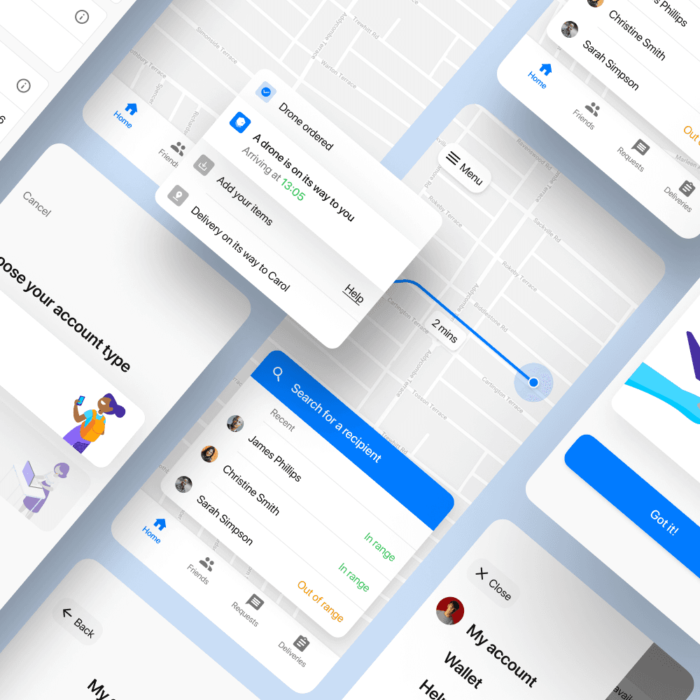
Postbot is an app based, user to user, drone courier service that I designed as my final year university project. Postbot allows users to send items to their friends via drones, ordered and tracked through the app. Below I detail my end to end product design process, ranging from market analysis and user research, to ux design and user testing. This project was later re-branded into 'Mealbot', a similar service for food delivery. I have included the videos for both below.
/ The process
Initial research
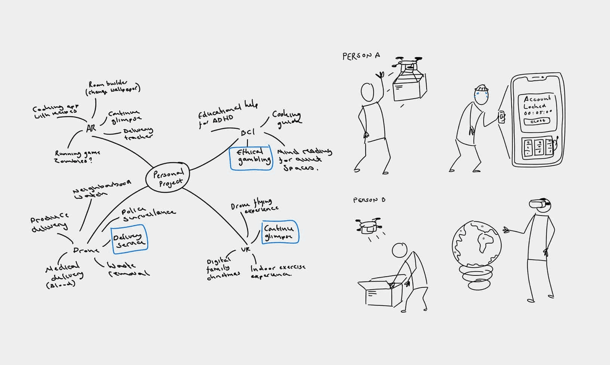
The brief for this module was to design a product or experience that makes use of a new technology. As this brief was so open, I started by looking into current technologies such as AR, VR, Drones and Brain interfaces.
User survey
To better understand who my user base would be, the concerns they might have and the assumptions they would have before using the product, I conducted an online survey that received 56 responses. I avoided talking specifically about my concept to avoid bias as much as possible.
User flows
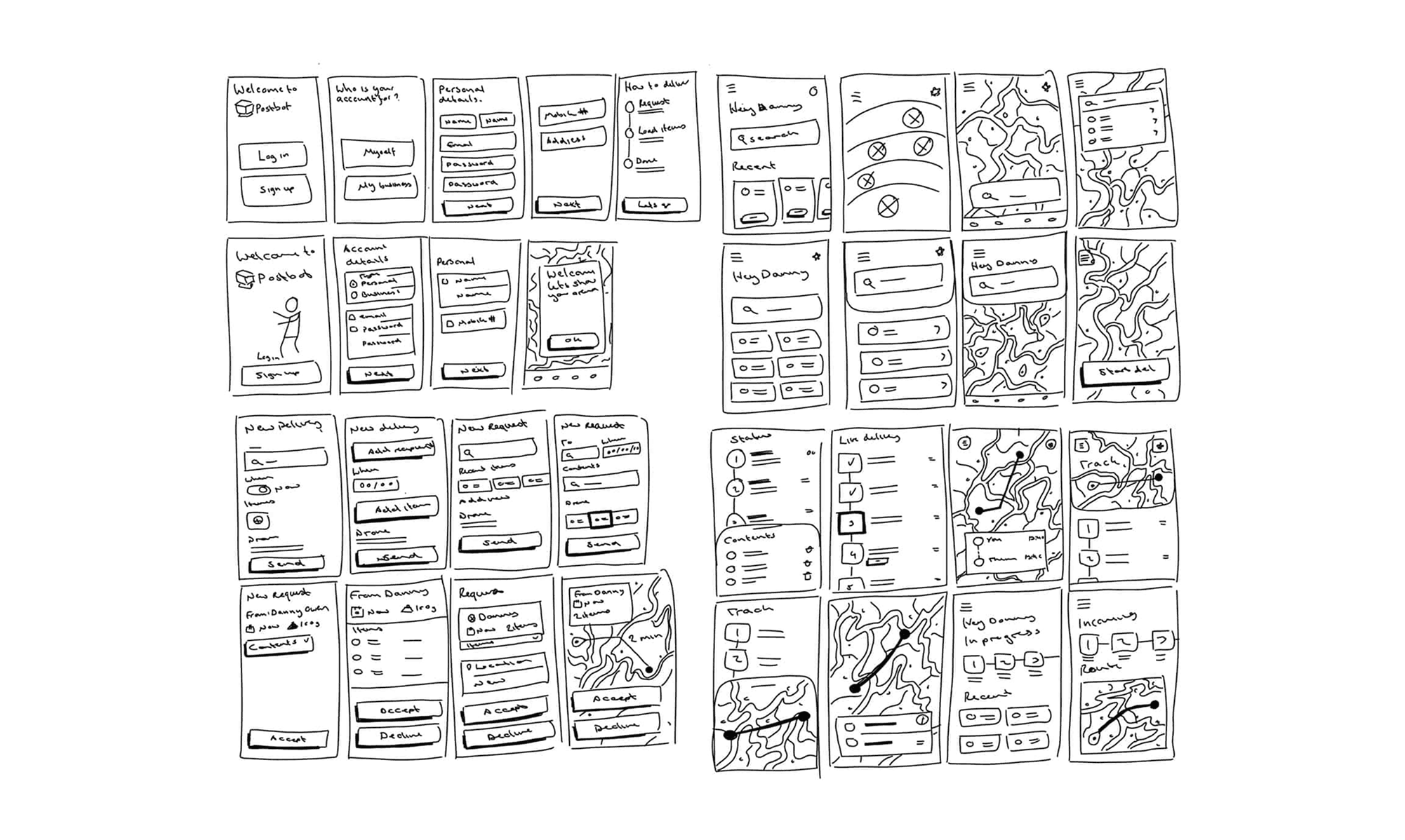
I first began mapping out user flows based on my personas to consider the features that will be required to offer my service, and the order in which users will need access to them. I also used this process to develop the process of carrying out a drone delivery safely. I developed a request system that involves users creating a delivery request, and only being able to send a delivery once their intended recipient has accepted their request. I began developing wireframes to better understand the information I will be presenting at each step of the process and the possible ways of presenting my service, particularly on the home screen.
User interviews
Using my wireframes I conducted semi-structured interviews with a number of possible users to get their thoughts on the structure so far. Completing this with wireframes rather than mockups meant the users focused more on the concept and process rather than small design details.
🏆 The participants didn't like the idea of other users being able to see their exact location, even if they were friends.
🏆 The participants thought they'd need tips during the process as it may take a few uses to learn.
🏆 The participants correctly assuemd only one delivery per user would be possible at a time.
User testing
Using my high fidelity designs I produced a Figma prototype of the core journey and carried out a number of remote user testing sessions. I used the feedback from these sessions to further refine my designs which resulted in the final designs displayed below.
🏆 Clear presentation of information helps users build the confidence to complete a payment.
🏆 The benefits of ensuring privacy won't be fulfilled if the user isn't made aware that their data is safe.
🏆 Icon based buttons are only effective if their meaning can be recognised faster than reading the word. For example, 'Help' over '?'.